EVOLUTION
Of My Brand IDENTITY

1996

2009

2023
My original logo had been in use for 30 years. The design was created with layers of deep meaning as well as connections to my Japanese heritage, and has sustained itself as my brand logo for decades because of the strong concepts that were designed with them in mind.
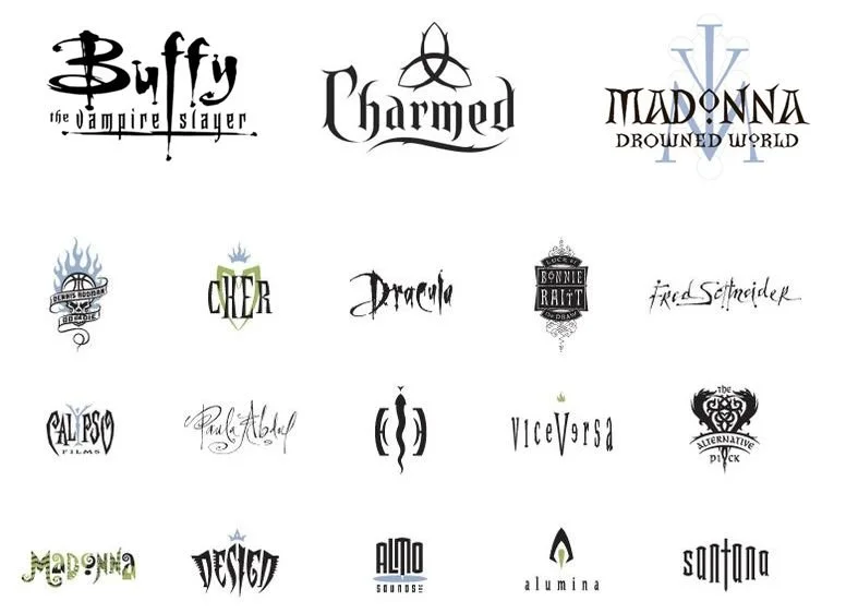
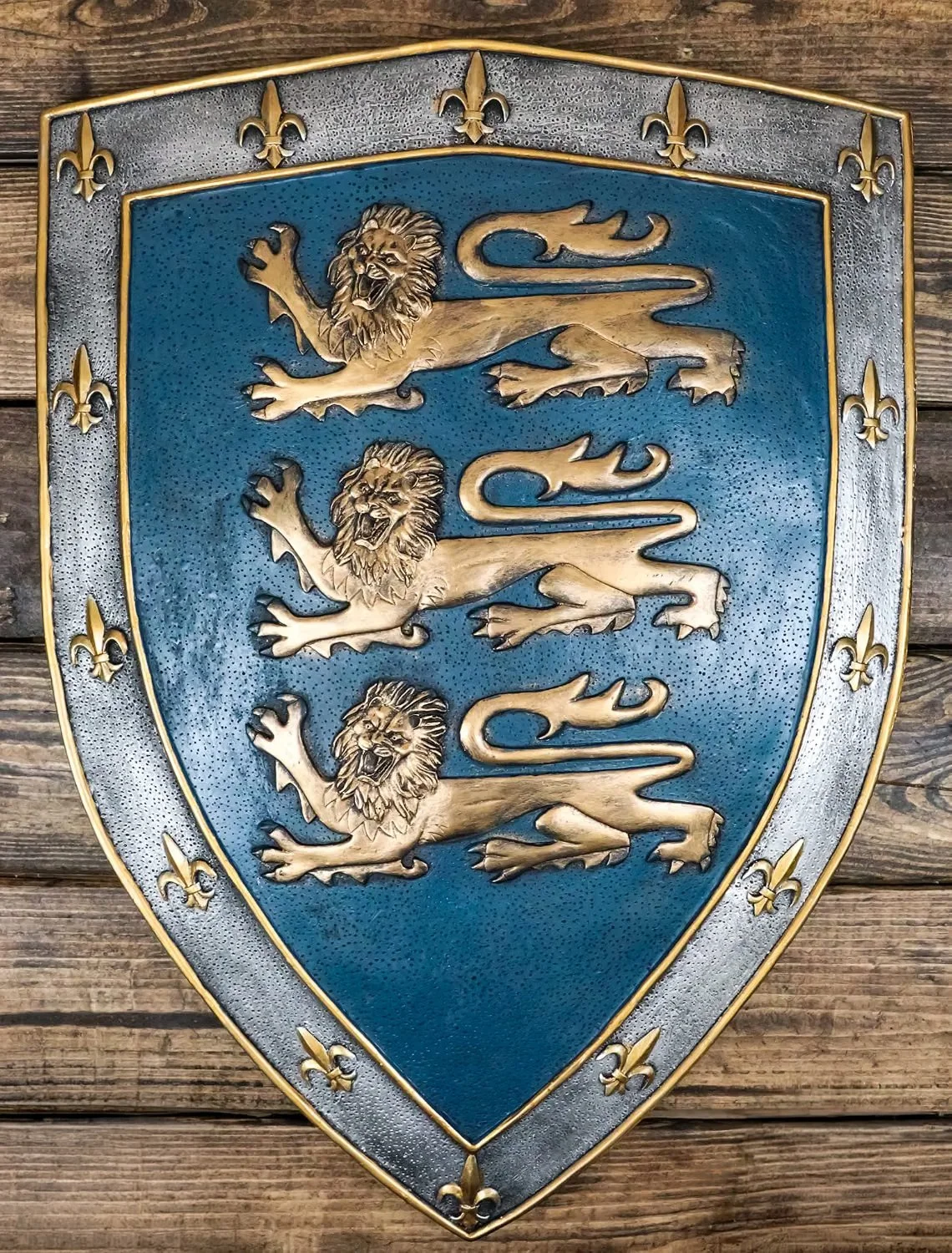
The most recognizable aspect of my logo was the shield/crest shape, that brought in a feeling of lineage and heraldry. And at the time I was designing it, I was heavily influenced and inspired by Margo Chase’s work, and how she handled typography.
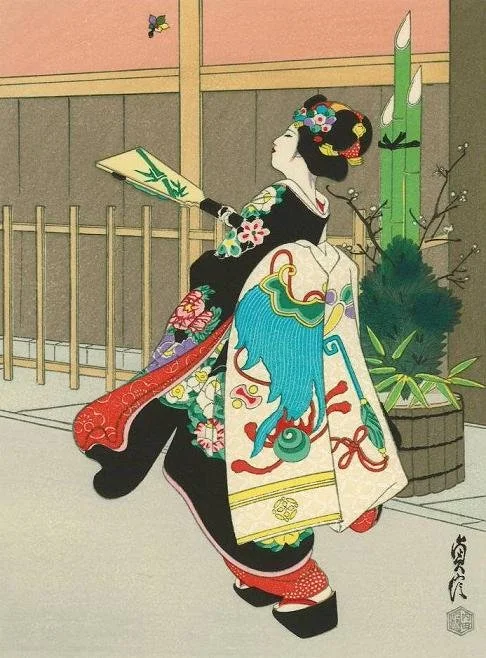
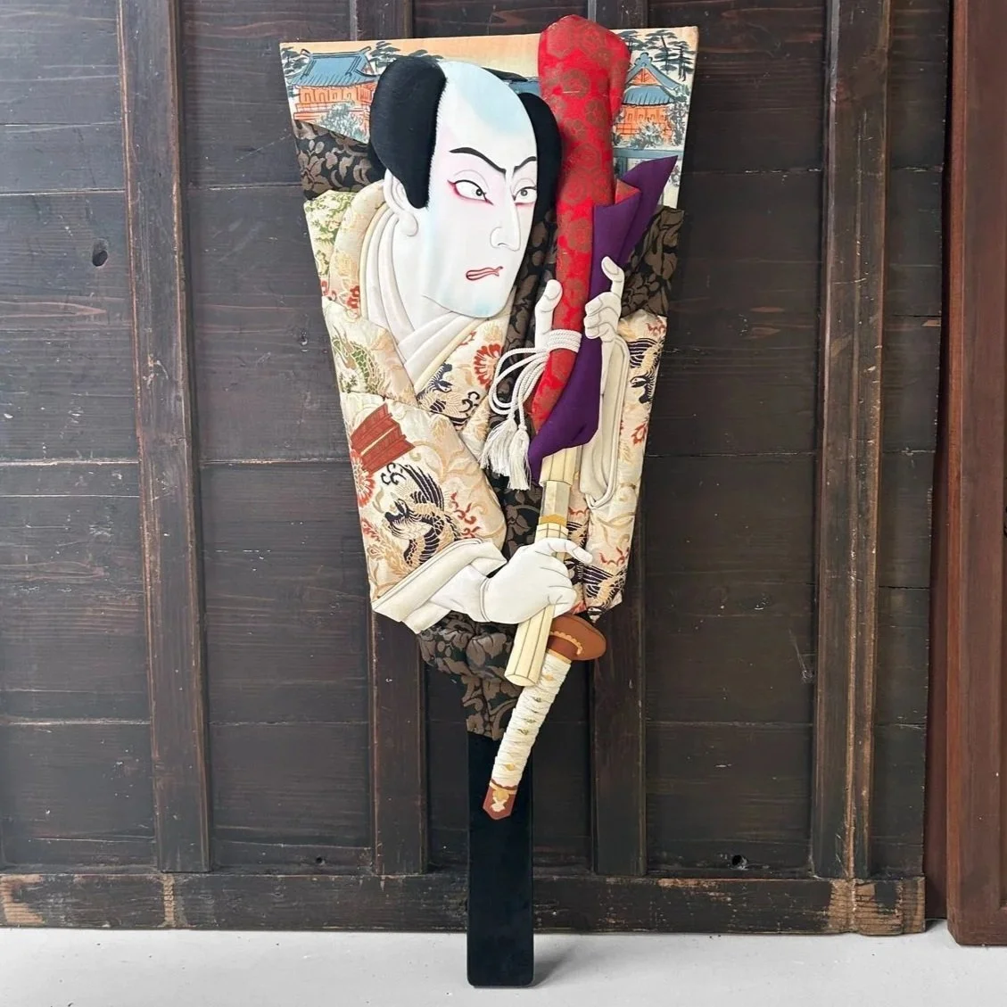
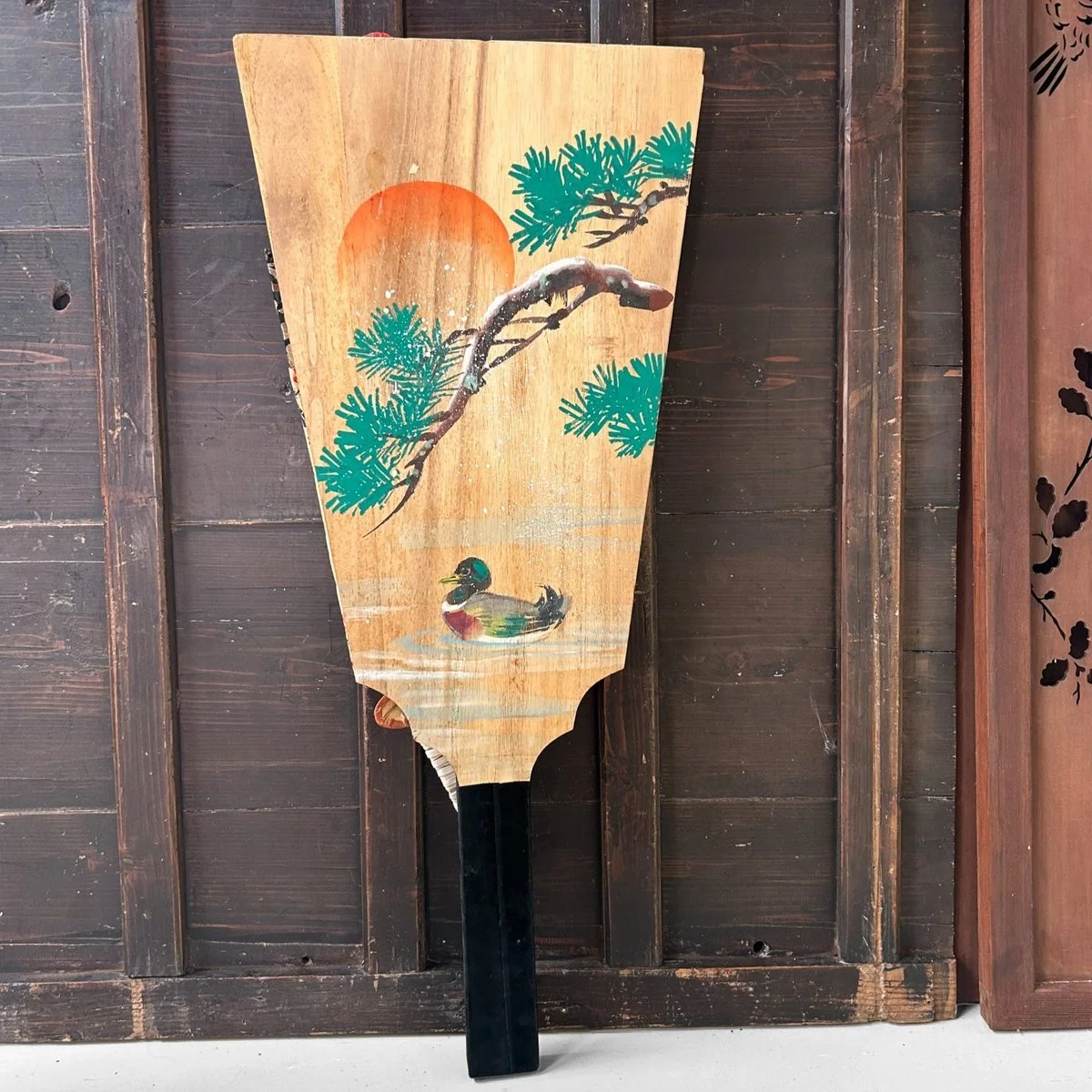
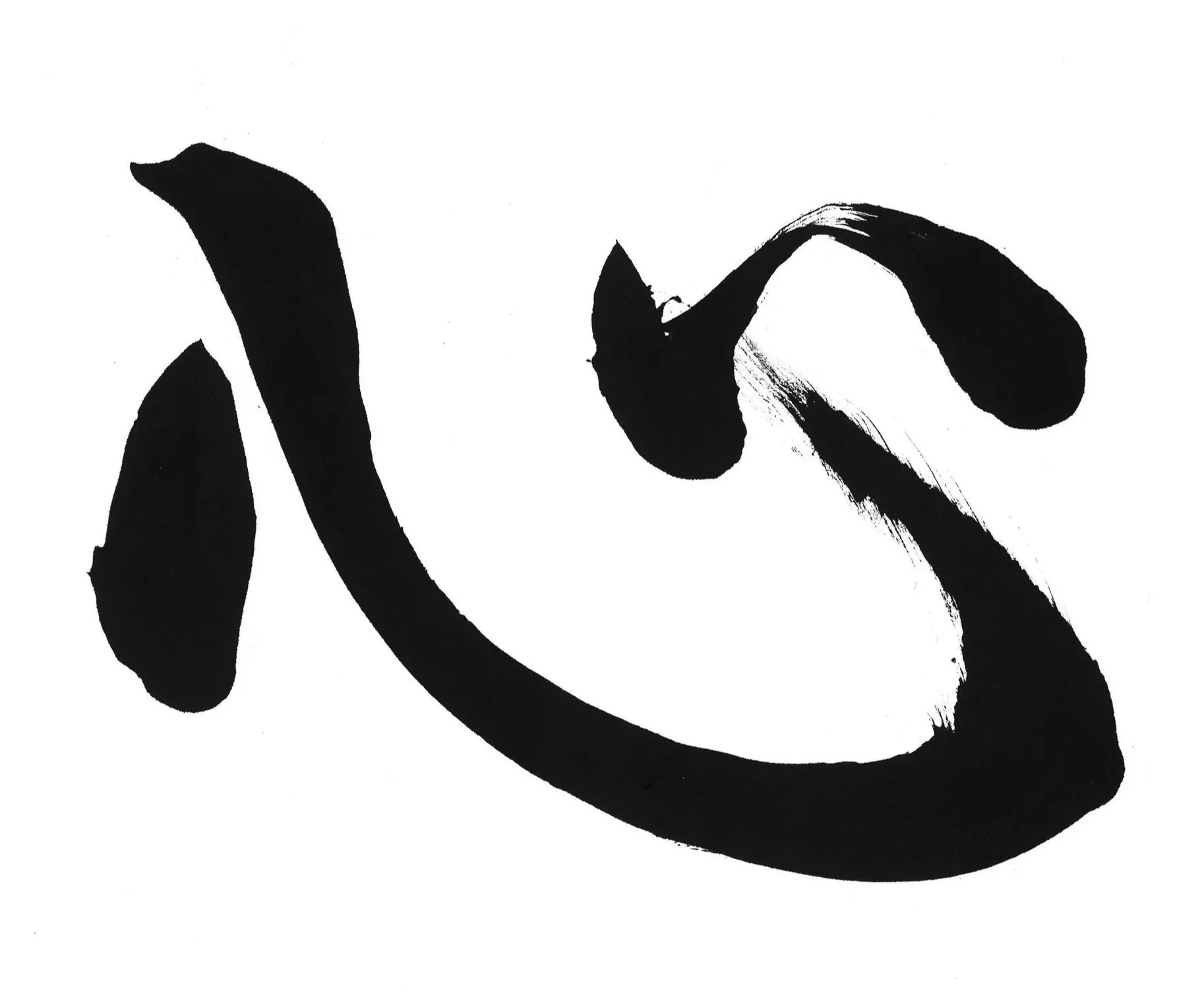
What most people don’t know, is that there is a strong Japanese influence in my logo design as well. In Japan, there’s a traditional badminton-like game called hanetsuki, and the paddle used is called hagoita, and it was used as inspiration when creating the mark. In addition to that, the stylized ‘J’ and ‘M’ both have a brush-like feel to them, similar to the strokes in Japanese calligraphy, or shodo.
Red is an auspicious color symbolizing a myriad of different things: luck, happiness, strength, protection, wealth, power, the sun, and is used in celebrations and festivals. The energy it brings, along with all it symbolizes, was why I chose it as my logo color.
“I put this much creativity, thought & energy into every job I work on. I treat every project as if it were my own.”
2026
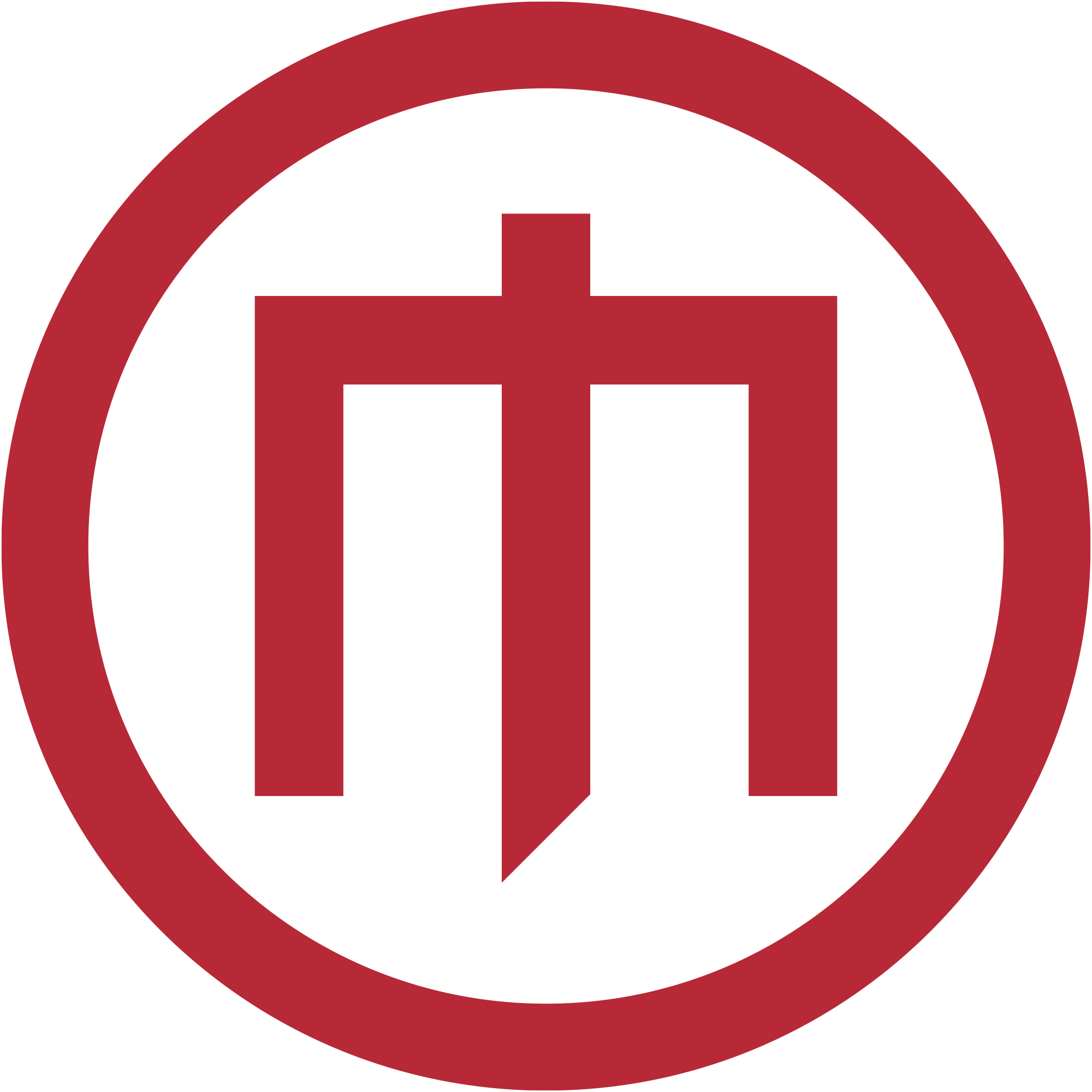
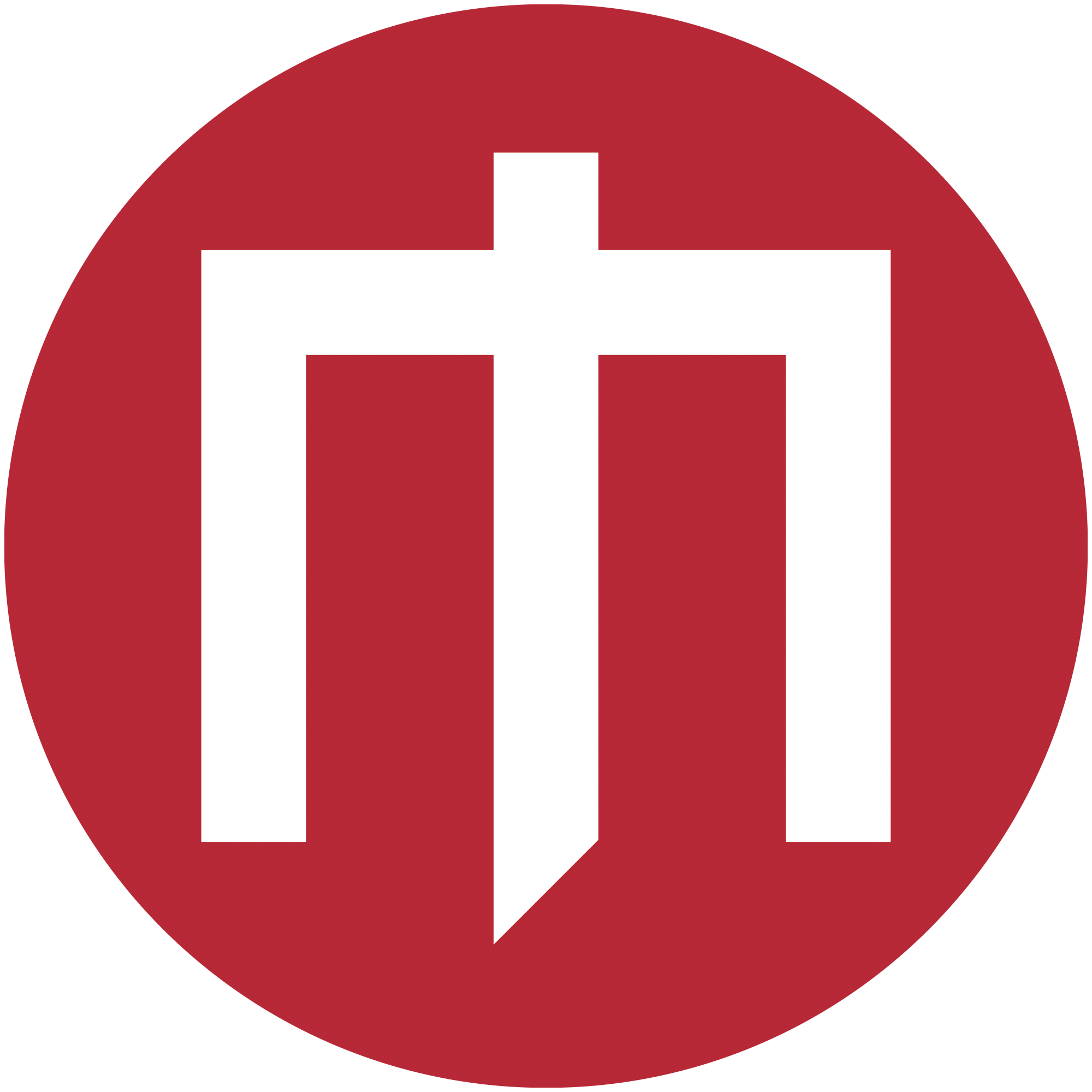
After 30 years, I wanted to create a new logo for my brand to use along side my services presented on this site. I still wanted it to tie into my Japanese heritage as well as keep some of the elements that are part of my original design, but update it to feel modern, with a hint of tradition.
hanko
kamon
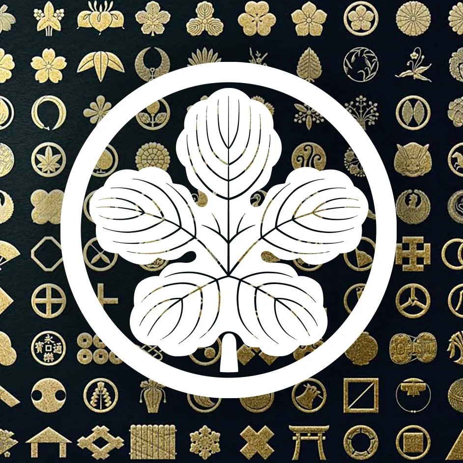
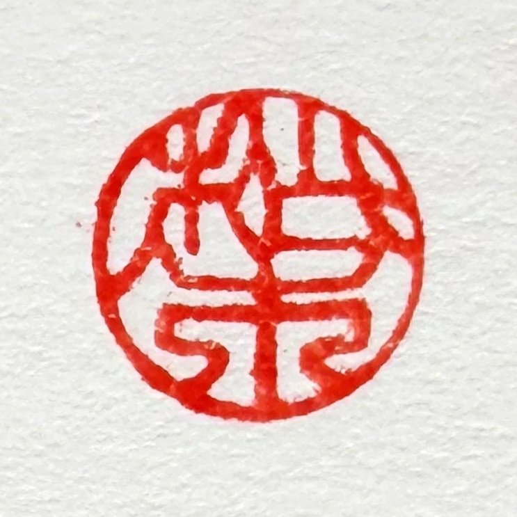
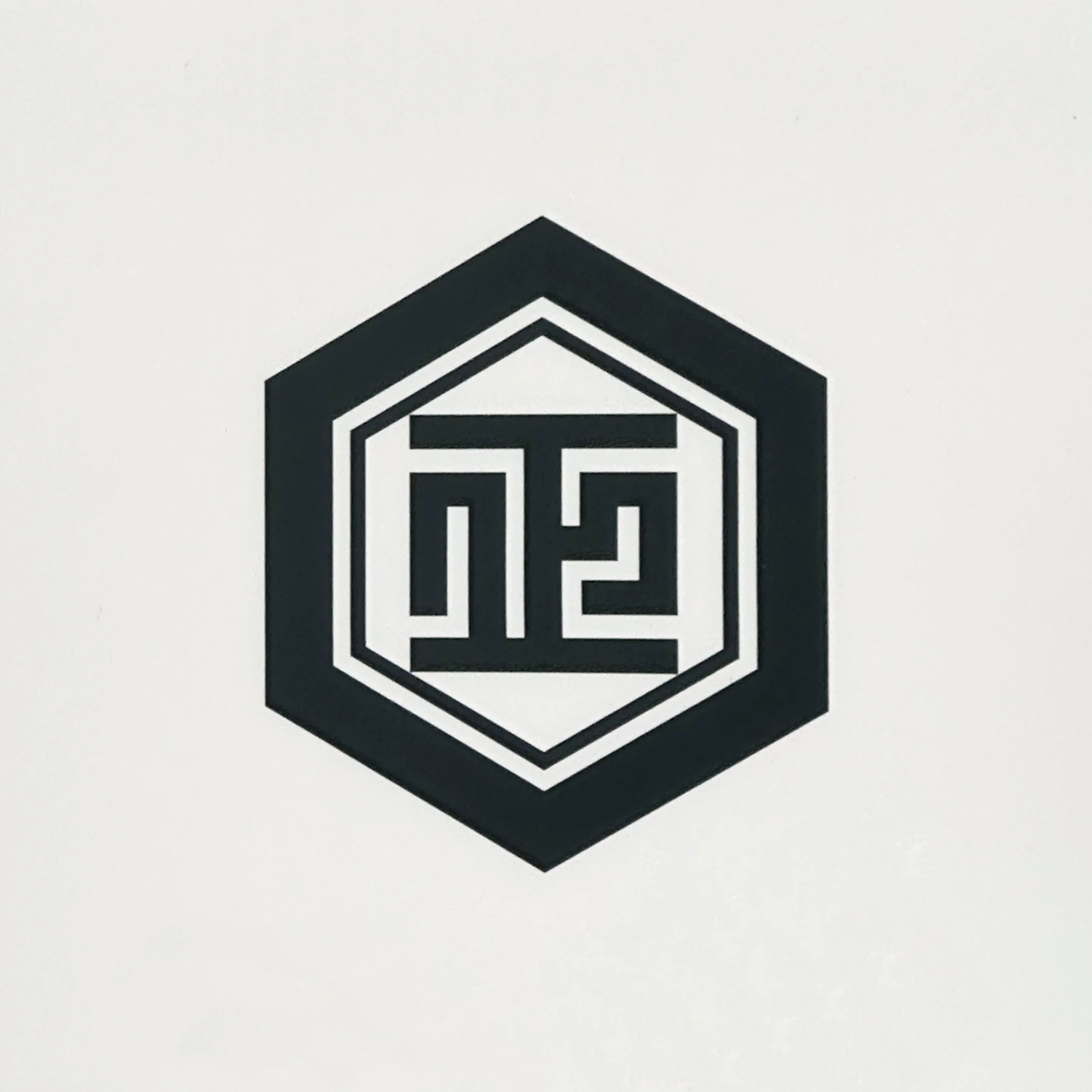
For inspiration, I turned towards my family. I’ve always loved the way our hanko (signature name stamp) looked. And our kamon (family crest) is one of thousands that I admire. I approached my design with these iconographic symbols in mind.
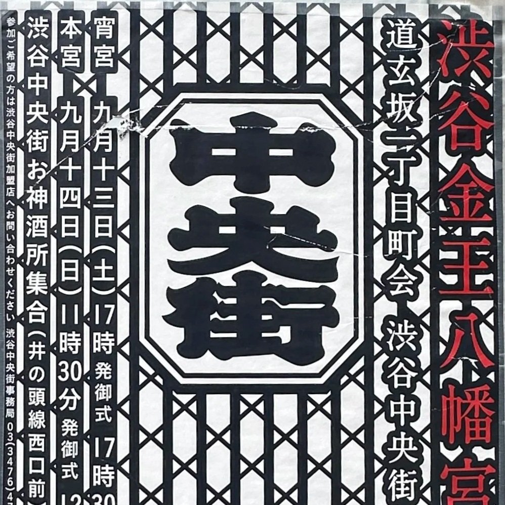
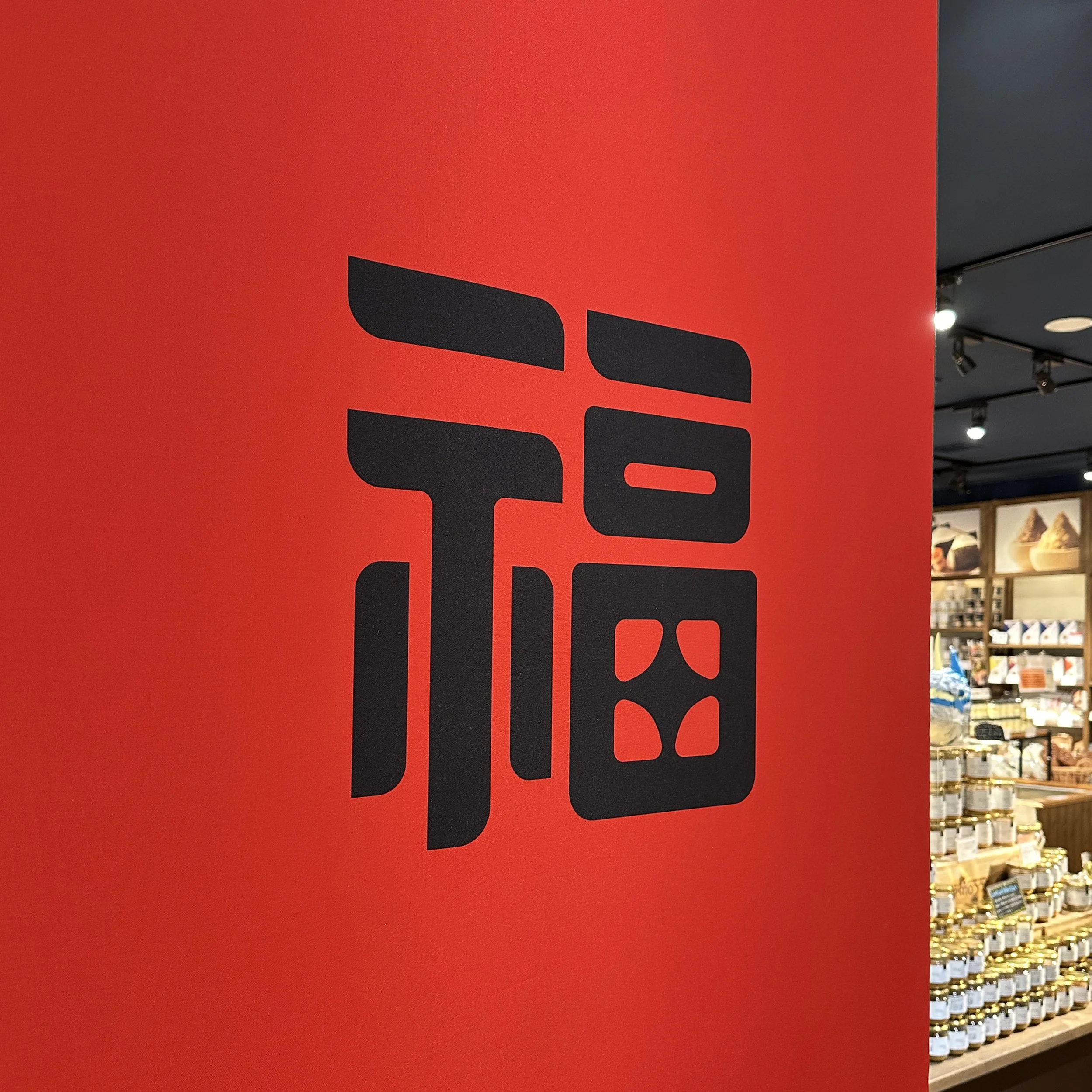
I also love the way Japanese signage handles kanji (Chinese characters). I shifted away from the calligraphic style for my initials, to go for a more angular look for the ‘J’ and ‘M’ in this new logo. The ‘J’ breaking above the top line of the ‘M’ represents going above and beyond the baseline effort. Additionally, the descender of the ‘J’ reminds me of the kissaki (tip of a samurai sword).
The combination of all these concepts and ideas together results in a logo that resembles a hanko and kamon, and still keeps true to the essence of my brand.