ATHENA DESIGNS
Dedicated to creating high-quality jewelry that is fun, fashionable, and at a price you'll love.
The Logo
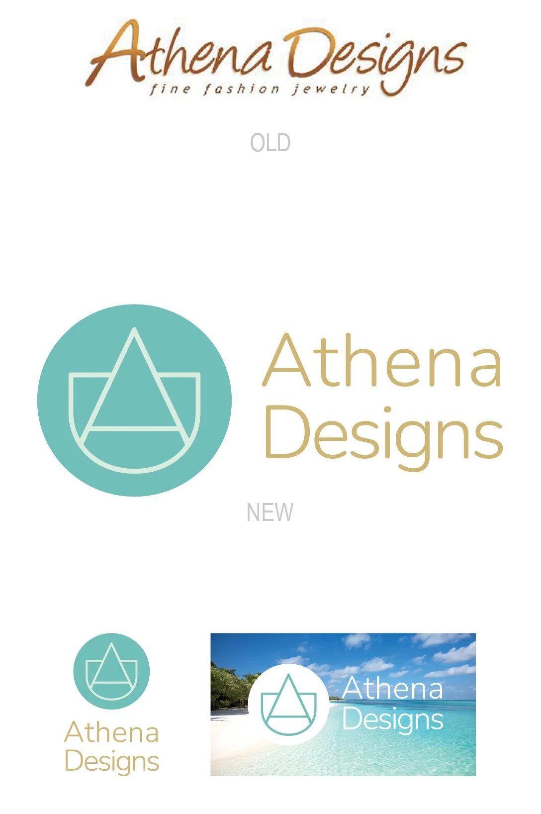
The new owner of this company wanted to take the brand into a different direction than it’s previous owner had created for it. There was a desire to bring the identity into a more elevated and modern arena.
When discussing the direction of the brand, the keyword, “resort,” came up in several converstations. Keeping this at top of mind, the logomark, utilizing the capital “A” and “D,” hints at a abstract sailboat, resulting in a resort-like feel.
The Colors
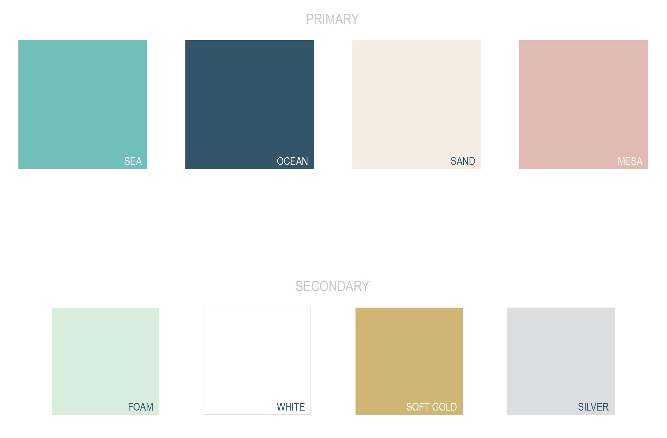
“Resort” doesn’t always refer to sandy beaches and tropical destinations. The owner wanted it to also include the mountain resorts, desert resorts and everything in between. We made sure that the color palette would encompass all of these, and also keeping it delicate to target the main demographic.
The Imagery
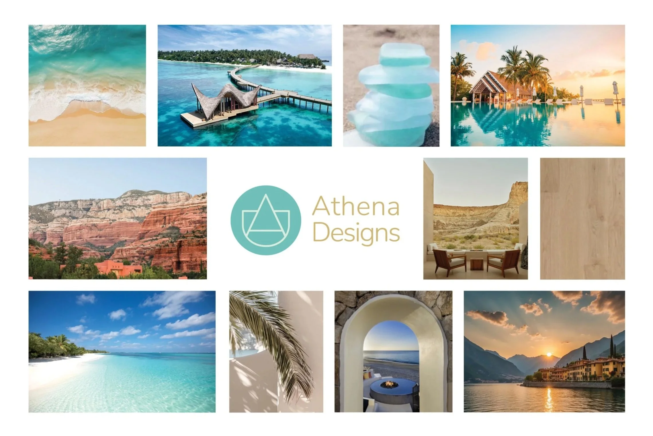
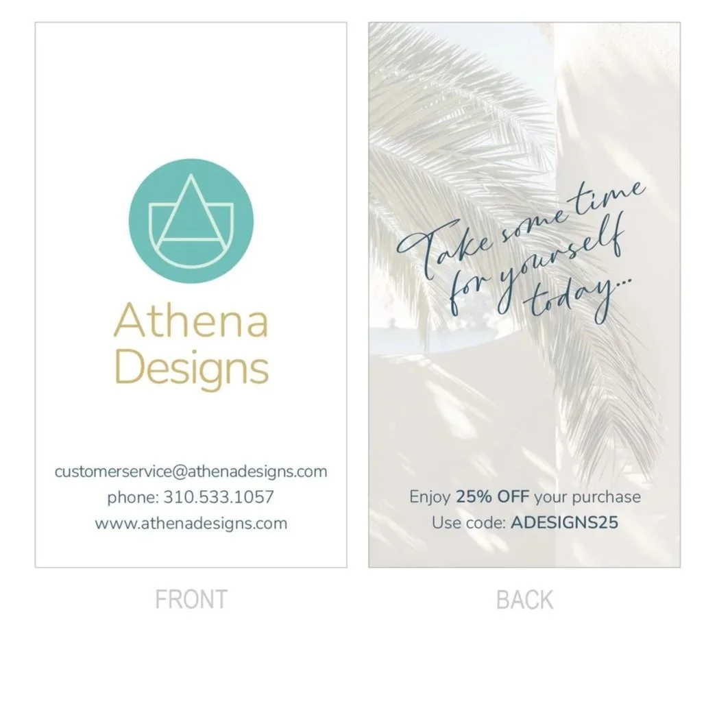
For promotional and marketing purposes, the images to reference are extremely important. Location is not the only thing to consider, but also the style of the photography. The textures and atmosphere should also convey a sense of relaxation and leisure, as well as an elevated experience.
The Print
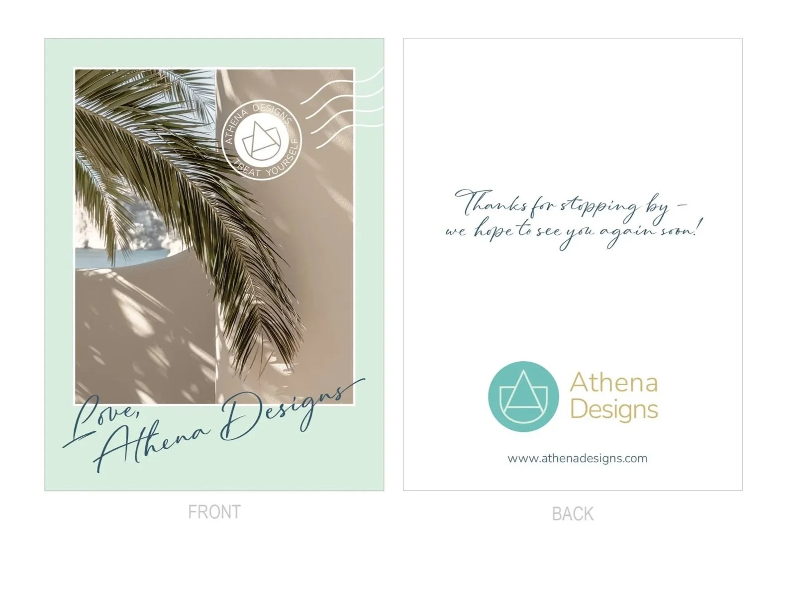
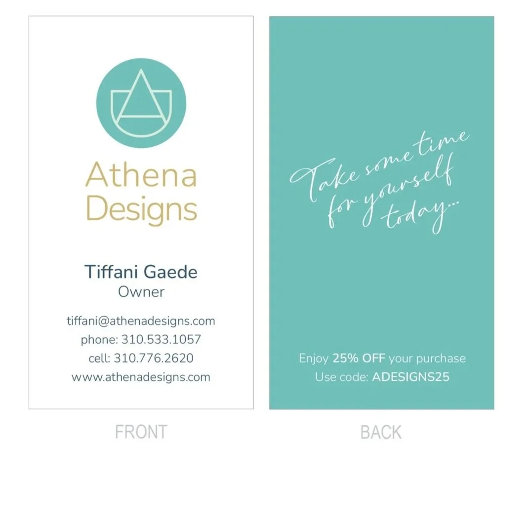
A “Wish you were here!” postcard was discussed as inspiration for some of the printed materials. With every order, an appreciation card is included, and the owner wanted to make sure it felt personal, as if it was mailed to you from a friend. Utilizing an additional script font helps convey this feeling.