
IMPRESSIONS FINE FOODS
High-end snack food company, dedicated to bring quality snacks to the market.
The Logo
This company’s roots are solidly planted in Asian and Pacific Island culture and influence. The client wanted this brand to feel elevated. By mimicking the shape of a pineapple, we leaned into it’s symbolism of not only hospitality, but also status.
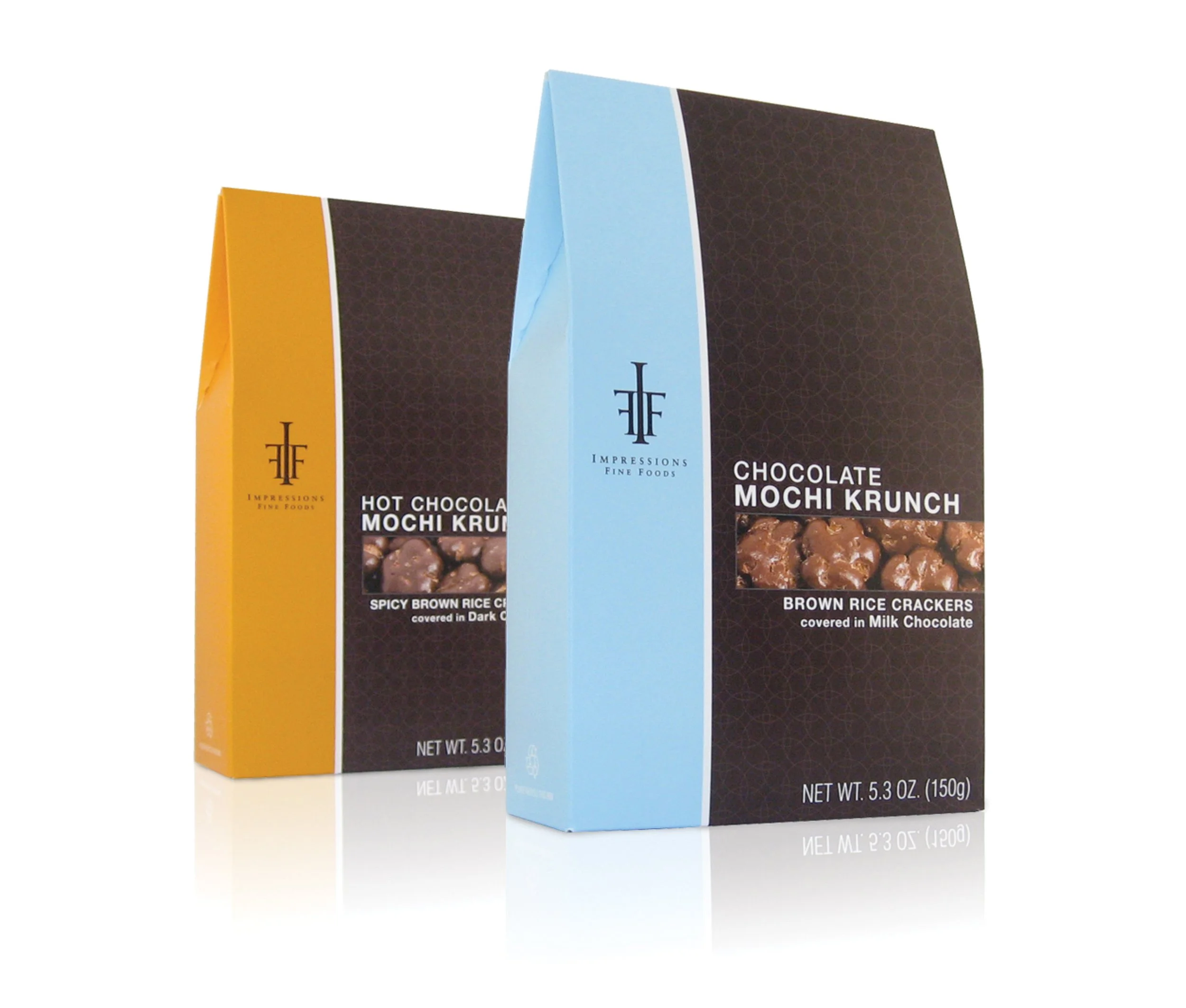
The Packaging
The packaging was designed hand-in-hand with the logo. Having a unique structure to work with, made it stand out on the shelves. The design elements were created in such a way that when the product line was expanded, additional colors could easily be used, but the essence of the brand wouldn’t change.
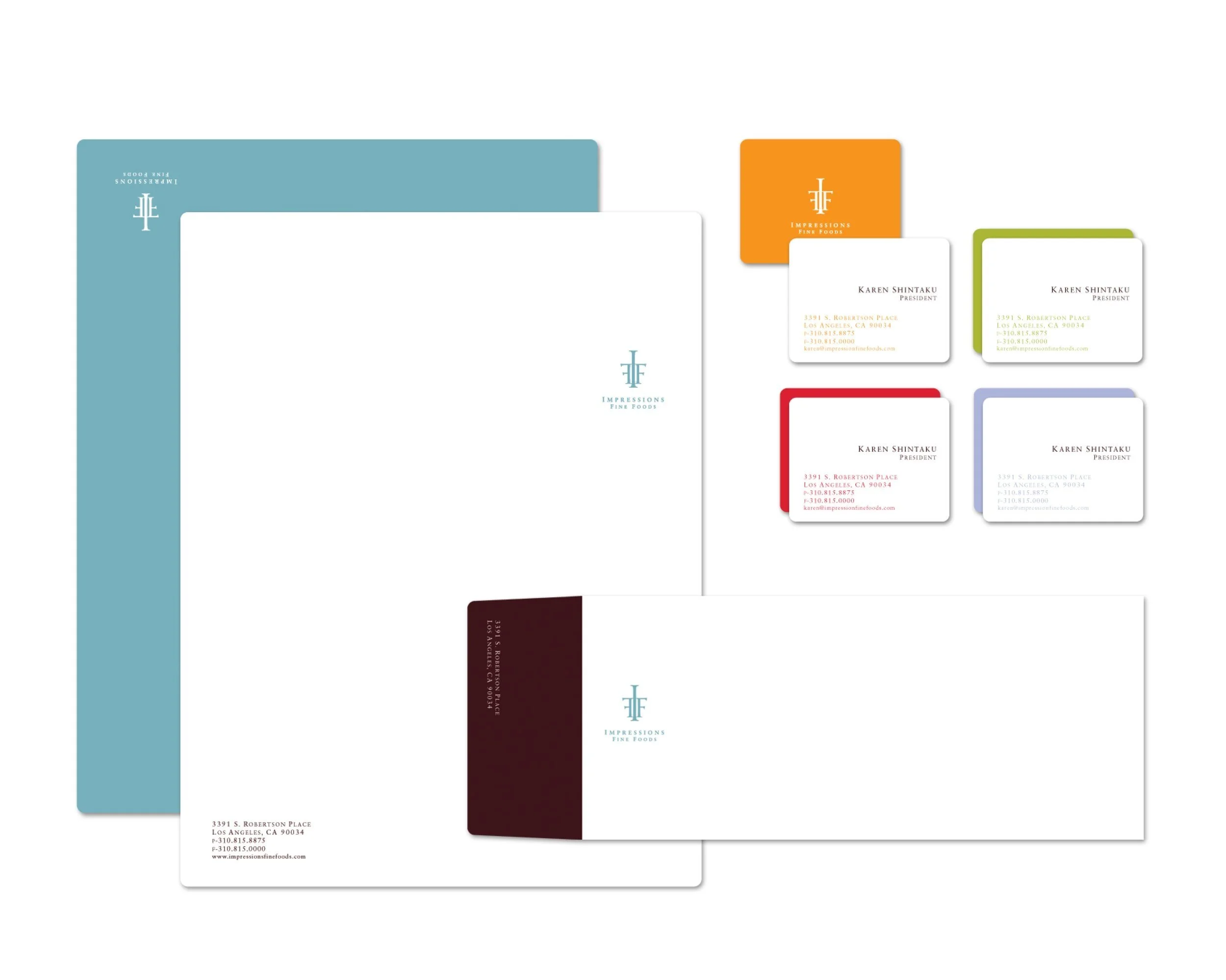
The Working Papers
Even though the goal was to create an elevated look, fun can still be conveyed with color usage. Opening up the palette also helps to inform what colors to use when the flavor line expands, and new packaging needs to be added.