
The Bouqs Co.
A modern floral brand that connects people to farm-fresh flowers and the partners who grow them.
The Task
The Bouqs had a solid base as a brand. But over the years, with a variety of directional changes, details kept getting piled on top of one another, convoluting and creating confusion when it came down to what the brand actually was. I was brought on board to help refocus the branding and bring clarity to what it represented and what elements represented the company.
The Approach
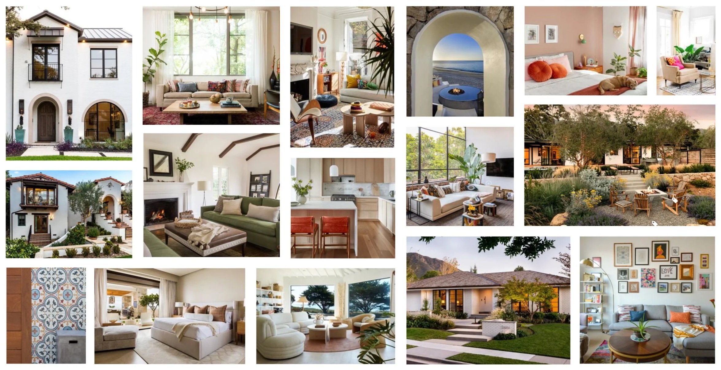
First steps were to figure out where the brand started from, where they were at that present time, and then explore where they wanted the brand to head. Making use of imagery and word associations, taking into account competitive positioning, along with other exercises, I was able to focus the brand and created a solid foundation to build from. Along with leadership, we were able to define the brand as, “California Cool” which distinguished and distanced them from competitors. That phrase would also influence other aspects of the company, from marketing to acquisition, and social media.

OLD

NEW PRIMARY & SECONDARY
The Colors
When it came to the old colors, the range felt broad, but not. There were a lot of hues, but because the differences were subtle a lot of the colors felt redundant. They also felt a little too bright for what The Bouqs could be.
To refine the palette, I paired down the greens and further defined the others. I focused in and made them more earthy, and grounded. I expanded into the secondary brand colors to play off of the range of the primary by adding the blue and brass, rounding out the foundation. Seasonal colors could be added, as needed.
OLD
NEW
the Fonts
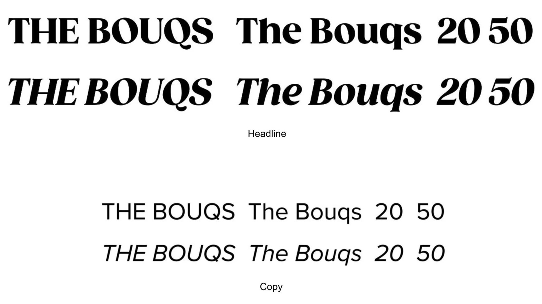
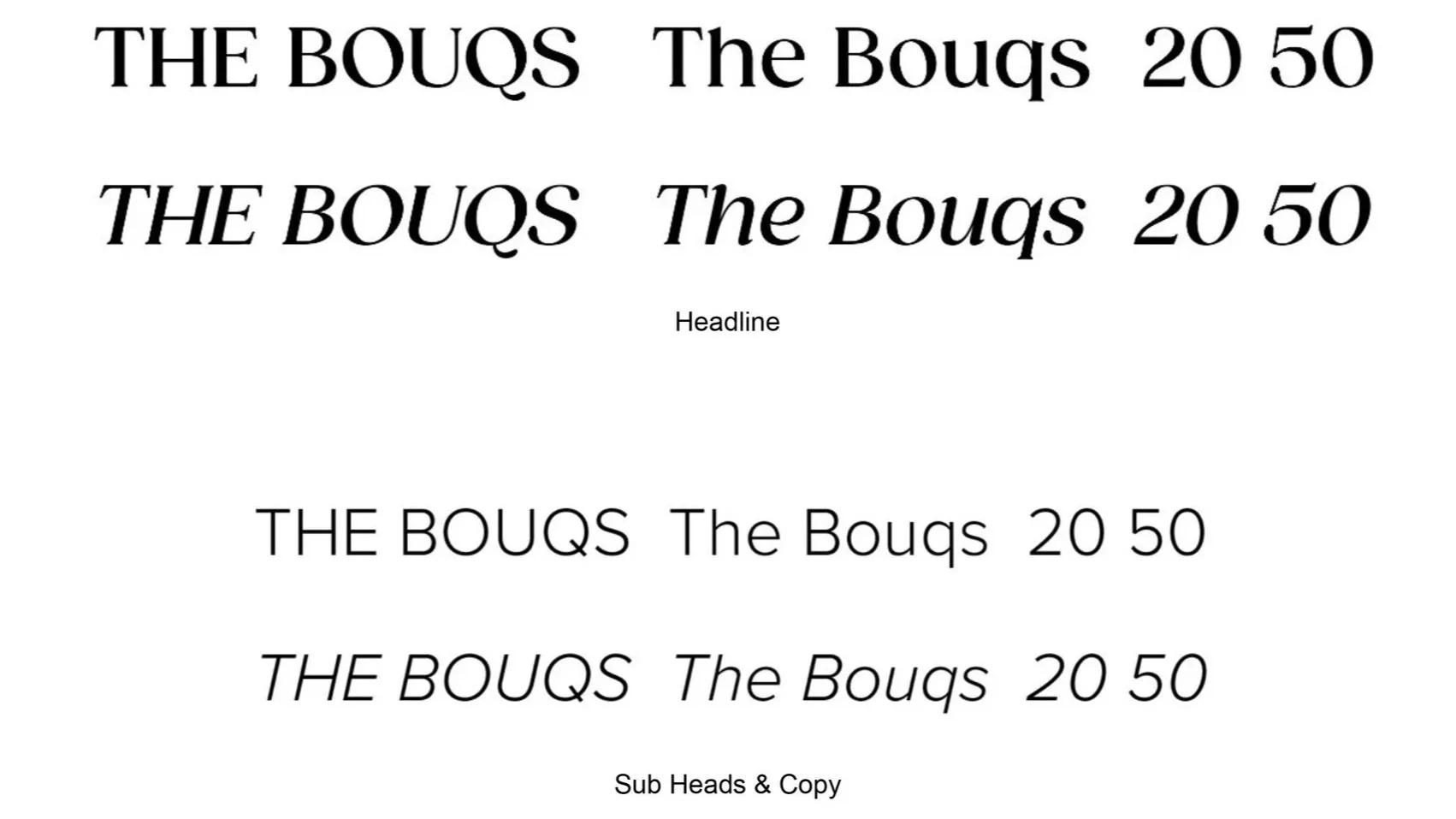
The original fonts, along with the old color schemes, made all the marketing assets feel overly cute, and borderline cartoon-like. In order to elevate the branding, and make it feel more sophisticated and “California Cool,” I thinned out the font width. I kept it within the same family to keep it recognizable, but by using a lighter weight, I achieved the elevation they were looking for.
OLD
NEW
The Imagery
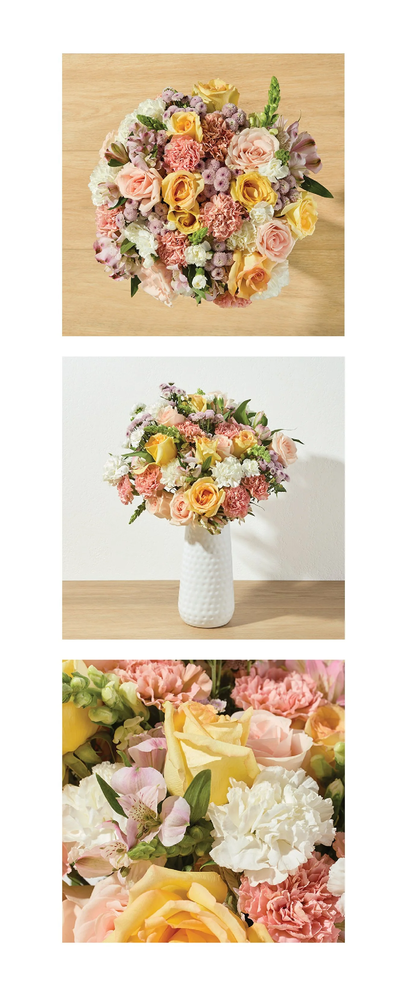
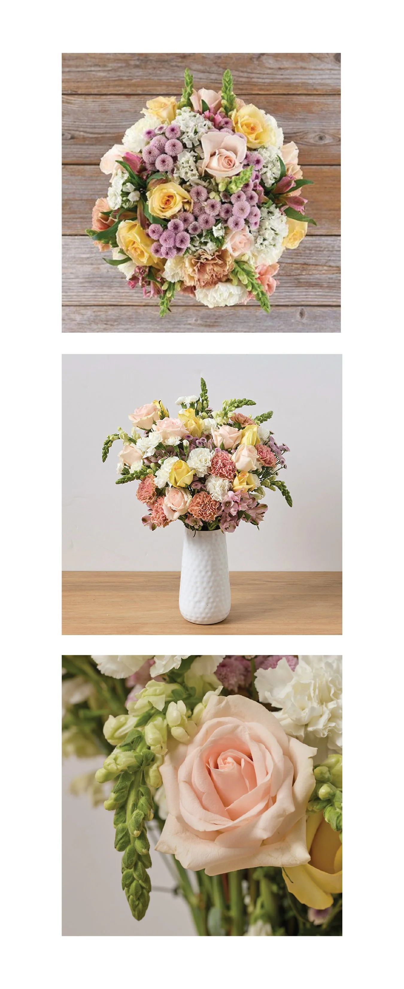
With all the updates to the colors and the fonts, I suggested that they should revise how the product detail page (PDP) images were to be photographed, as well. The original overhead arrangement was shot against a rough wood backdrop to reflect the brand’s farm-fresh origins. But with the evolution, a white oak background paired with a white stucco wall for profile images, shot with a sunlight inspired lighting scheme, matched well with the “California Cool” theme.
Updated PROCESS
Along with the revised photography, I noticed some inefficiencies with the shot lists. There were a handful of PDP images that were redundant, or nearly redundant. We reviewed the images and decided to cut a lot of them, and considered shooting others only when called out specifically by the Merch Department. Reordering the shooting order helped the shoots run quicker and there wasn’t as much wasted downtime, switching back and forth from different setups.
In addition to the revised PDP photo shoots, I also reviewed how their lifestyle photo shoots were planned and executed. I updated that process, as well, to run a lot more efficiently. I introduced a shoot deck that spelled out the schedule, listing which arrangements were to be photographed in specific scenes, including props and models and other photo details.
With these changes, I worked with the Merch and Marketing Departments on adjusting some of their milestones to give all departments the time they needed to execute their own processes effectively, and still be able to fulfill requisites.
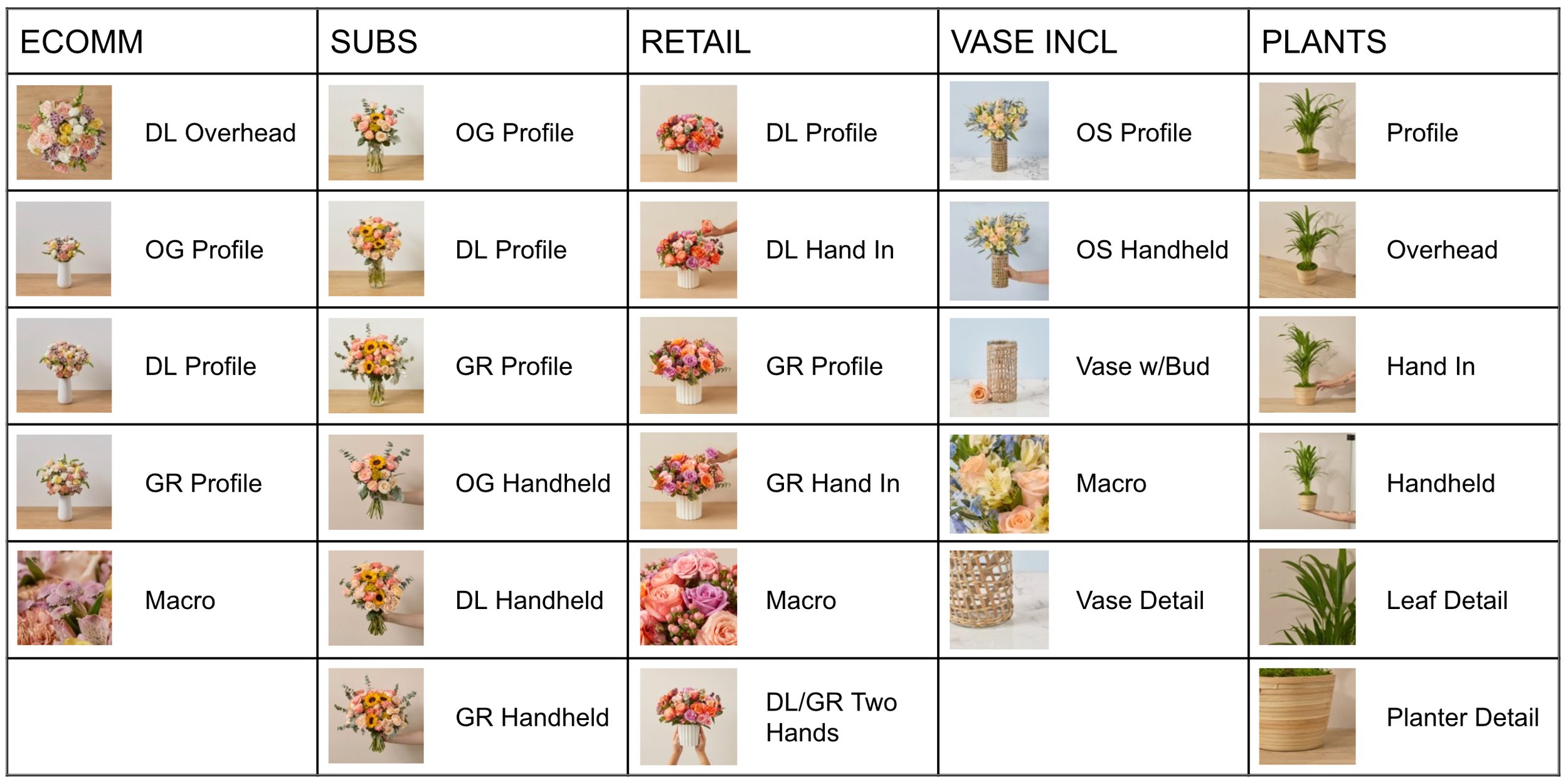
ORIGINAL PDP SHOT LIST
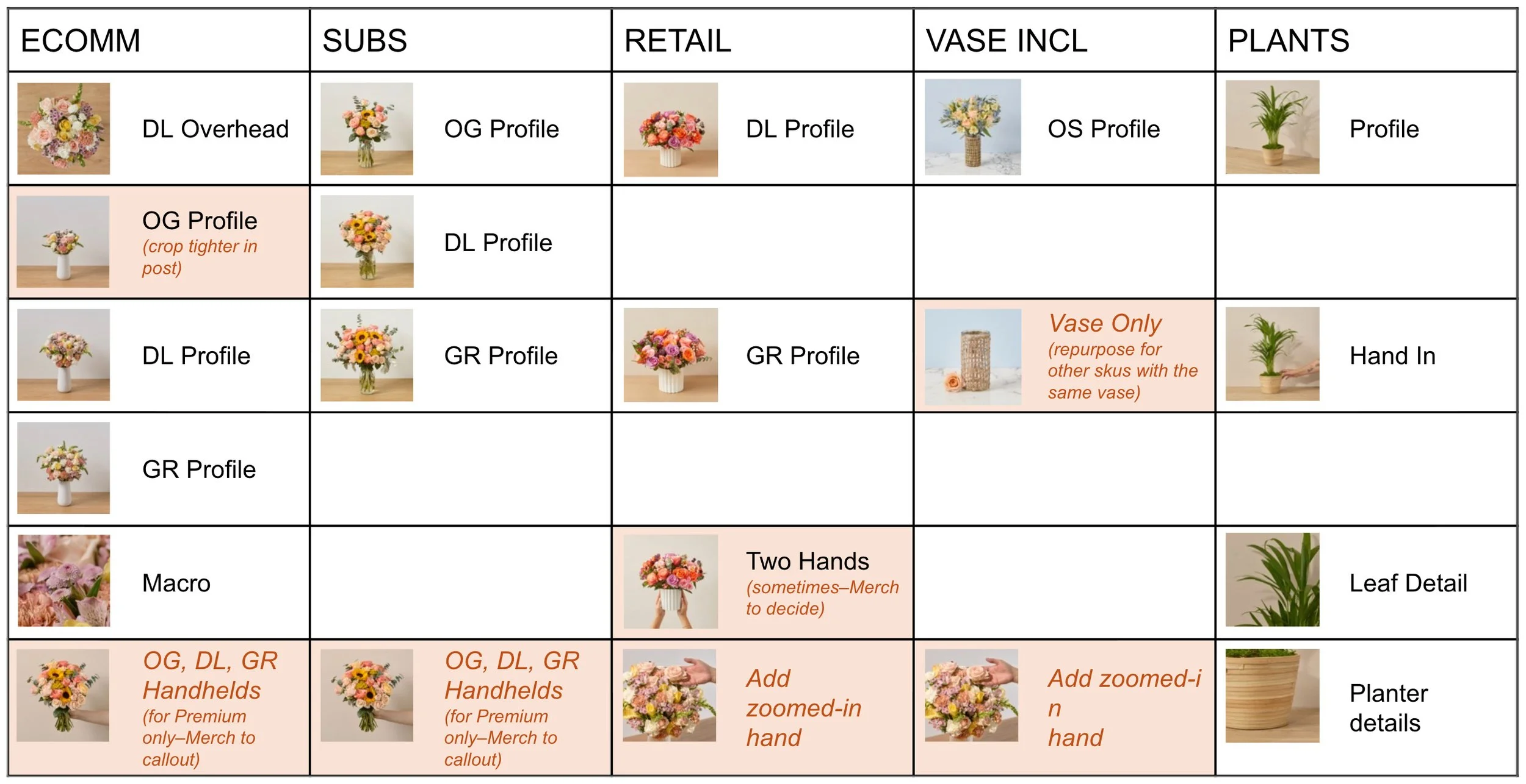
UPDATED PDP SHOT LIST