Identity
A selection of logos developed for a variety of brands and companies, spanning diverse industries.
KOI RESTAURANT
Using traditional Japanese wall art, or kakejiku, as inspiration, this reimagined restaurant logo helped bring elevation to the establishment. The image of the koi was created using actual sumi-e, or Japanese brush work.
Oasis Audiology, LLC
The client knew the feeling they wanted the logo to convey, with keywords such as compassion, kindness and dedication, and with descriptor words in their company name, that was enough information to create this identity. Utilizing the sound wave icon as the base, the circle representing the sun, and a stylized palm tree, synonymous with oasis imagery, the logo came to fruition.
Athena Designs
The new owner of this company wanted to take the brand into a different direction than it’s previous owner had created for it. They wanted to take their identity into a more elevated and modern arena, but still keep it approachable. Click the link to see how we refocused the brand.
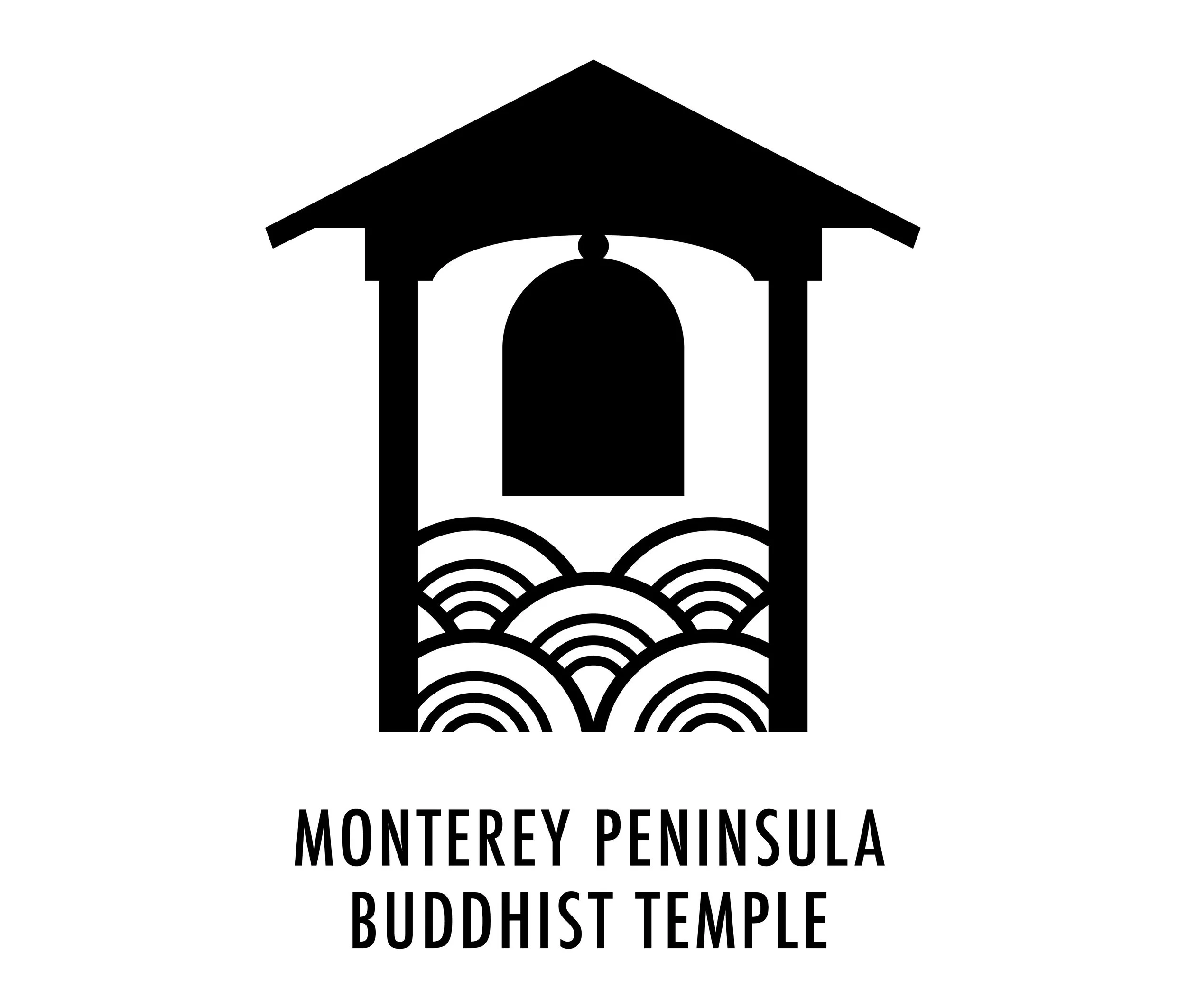
Monterey Peninsula Buddhist Temple
The kanshō, a bell used to summon parishioners at the start of a service, is a recognizable structure at this temple. Using it’s silhouette was a logical choice. The Japanese wave pattern (seigaiha) was chosen because of the close proximity this temple is to the California coastline.
Impressions Fine Foods
This company’s roots are solidly planted in Asian and Pacific Island culture and influence. The client wanted this brand to feel elevated and premium. Mimicking the shape of the pineapple, we leaned into it’s symbolism of not only hospitality, but also status. Click the link to learn more about this project.
Beau+Ashe
This shoe brand wanted to convey their urban and industrial roots in it’s logo. The attitude needed to shine through, presenting as confident and bold, but still attainable.
Paper Fox
Nightlife is exciting and electric. This shoe brand wanted to convey that presence in their branding. Using neon yellow as their core color, and sharp lettering that relied on gestalt to be read, you are able to feel it’s energy.
The Excel Group
This is a firm that helps companies find and recruit talent for career placement. The thought behind this identity was to use four uppercase “E" to create an “X.” This symbolizes, “X marks the spot” (to find the talent you’re looking for).